


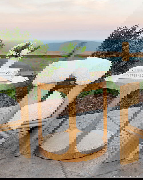
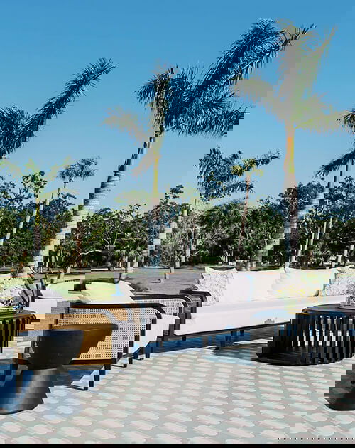


Design on the Go
Every great design starts with discovery. Explore all that Nuage Designs has to offer in one comprehensive resource: our Design Trunk.
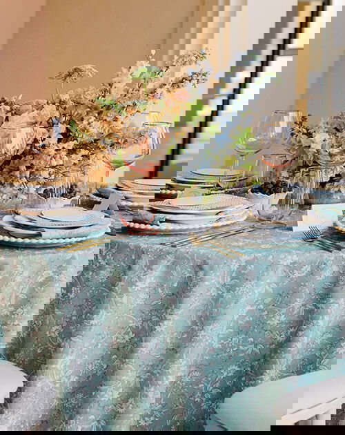
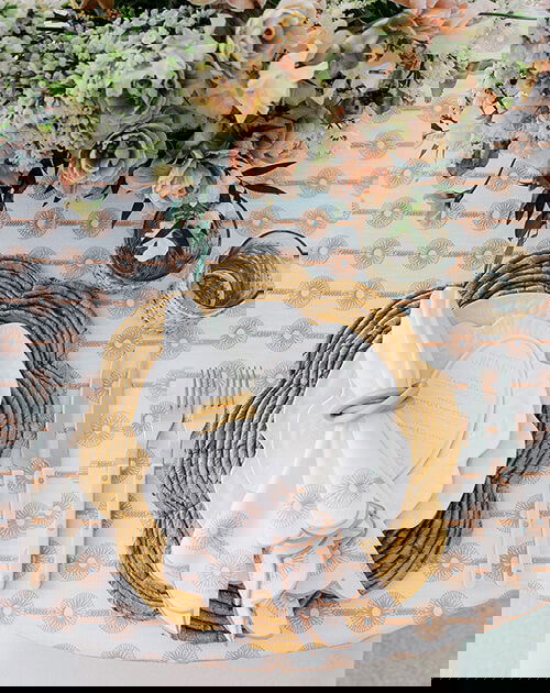
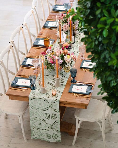
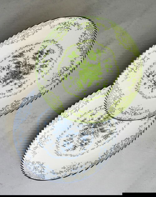
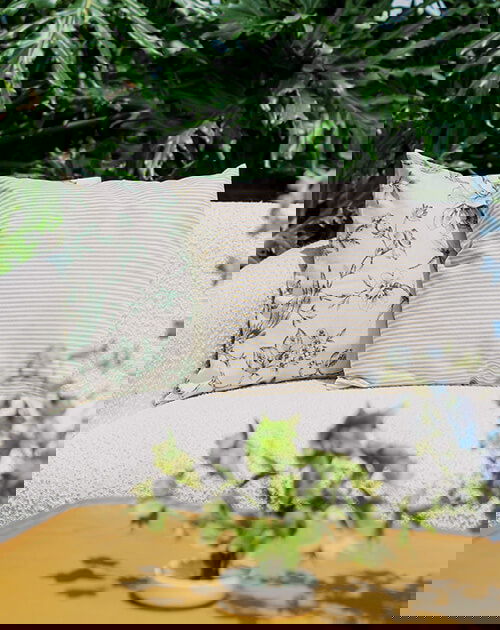
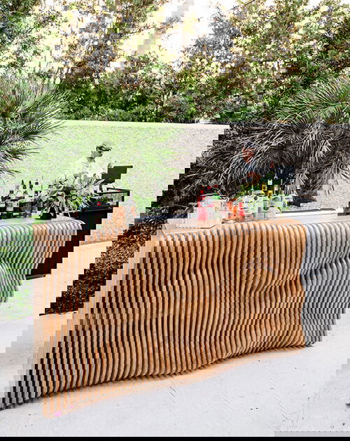
Filled with more than 350 swatches that span decades of design innovation, our Design Trunk is the quintessential resource for discovering your next brilliant design. Journey through prints, embroidery, velvets and more in an exploration of design choices that reset the standard of excellence.
Explore the Design Trunk


